SigmaPlot New Features
SigmaPlot has new features to make your work easier (click on the below links)
New Graph Type (Via a Macro)
Violin Plot
Visualize Data Distributions with Clarity and Precision
SigmaPlot 16 brings you a powerful new macro for data visualization – Violin Plots. This innovative macro offers a more comprehensive and informative way to depict the distribution of numerical data for one or more groups.
What are Violin Plots
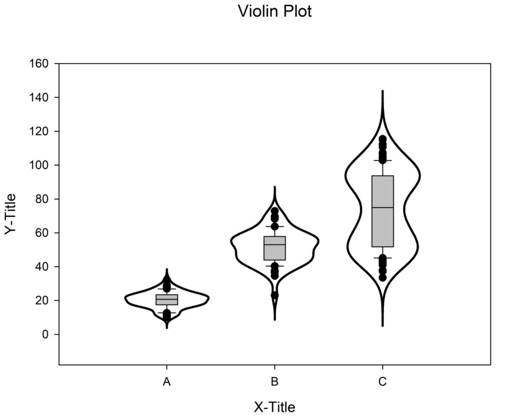
Violin Plot is used to visualize the distribution of numerical data of different variables. It depicts distributions of numeric data for one or more groups using density curves. The width of each curve corresponds with the approximate frequency of data points in each region.
Use the New Violin Plot Macro when you want to observe the distribution of numeric data, these are especially useful when you want to make a comparison of distributions between multiple groups. The peaks, valleys, and tails of each group’s density curve can be compared to visualize similarities and differences within groups.
This macro creates violin plots with multiple data columns showing the data density/concentration of each column or group.
Input Data
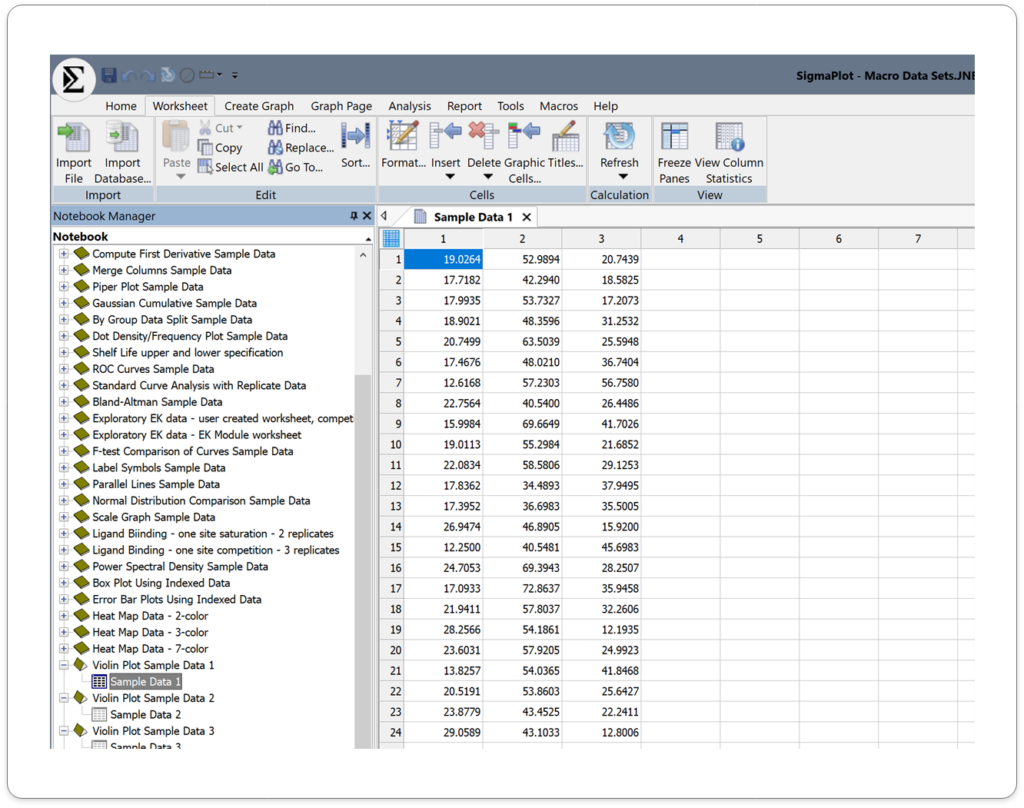
Arrange Violin plot data using many columns. Topmost row is for column labels, and Left most column is for row labels. These labels appear on the Axis for the Violin plot. However, you can also create a Violin plot without any labels.
Data should contain only the numeric values, without missing or empty cells within the data in each column.
Output
Application areas for the new Violin Plots in SigmaPlot v16.
1. Biology and Medicine
- Gene expression analysis: Compare gene expression levels between different groups or conditions.
- Proteomics: Analyze protein abundance and distribution.
- Clinical research: Study the distribution of patient outcomes or biomarkers.
2. Environmental Science
- Species diversity: Compare species richness and abundance across different habitats.
- Climate change analysis: Examine changes in environmental variables over time.
- Pollution monitoring: Analyze pollutant concentrations and distributions.
3. Social Sciences:
- Survey data analysis: Explore the distribution of responses to survey questions.
- Economic research: Analyze income distribution, consumer behavior, or market trends.
- Social psychology: Study attitudes, beliefs, and behaviors within different populations.
4. Engineering and Technology:
- Manufacturing process analysis: Evaluate the distribution of product quality metrics.
- Materials science: Analyze the properties of materials and their variations.
- Performance testing: Compare the performance of different systems or components.
5. Other Applications:
- Finance: Analyze stock price distributions, risk assessment, or portfolio performance.
- Psychology: Study psychological traits, cognitive abilities, or personality differences.
- Education: Analyze student performance, learning outcomes, or teaching effectiveness.
This combined approach offers a richer understanding of your data compared to box plots alone.
Key Benefits of Violin Plots in SigmaPlot 16:
- Enhanced Data Understanding: Gain deeper insights into your data’s distribution and identify patterns or outliers.
- Improved Visualization: Create visually appealing and informative plots that effectively communicate your findings.
- Easy Customization: Customize the appearance of your violin plots to match your specific needs and preferences.
- Integration with Other Plot Types: Combine violin plots with other plot types, such as scatter plots or bar charts, for more comprehensive analysis.
Butterfly Plots:
Unlock the Potential of Your Data with Butterfly Plots
With SigmaPlot 16's Butterfly Plots, you can take your data analysis to the next level. Download a free trial today and experience the power of this innovative visualization tool.
New Graph Type (Via a Macro)
Unleash the Power of Data Visualization with Butterfly Plots
SigmaPlot 16 brings you a powerful new macro for data visualization - Butterfly Plots. This innovative macro offers a compelling way to visually compare two datasets side-by-side, revealing insights that might otherwise be hidden.
What are Butterfly Plots?
Butterfly plot is a type of bar chart that utilizes a unique visual style to highlight differences between two datasets. By comparing the lengths of the bars and their associated error bars, you can easily identify significant variations.
This Macro draws butterfly plots using the two different groups, events or categories of the data worksheet.

Input Data:
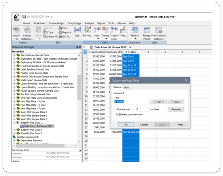
Column Title – To change the column title, select the worksheet column, right click and select the option column titles. The pop-up box will enable you to change the column title. This can also be done by double clicking on the selected column title cell. Leave the display value clear if you are not using column title.
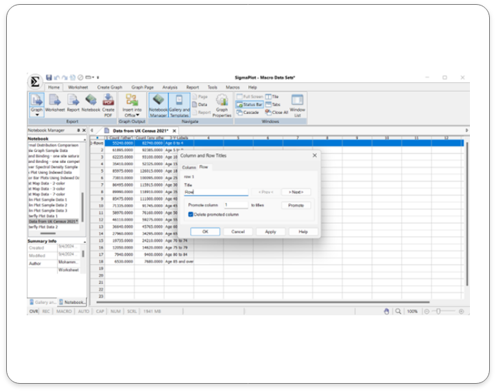
Row Title – To change the row title, select the worksheet column, right click and select the option column titles. The pop-up box will give you the option to change the row title. This can also be done by double clicking on the selected row title cell and inputting the details directly on the worksheet. Leave the display value clear if you are not using row title.
Run the Macro – After running the macro, the pop-up menu enables you to assign data to Group one and Group two.
Enter the Butterfly data in adjoining columns.
Click on the ‘OK’ button to run the macro
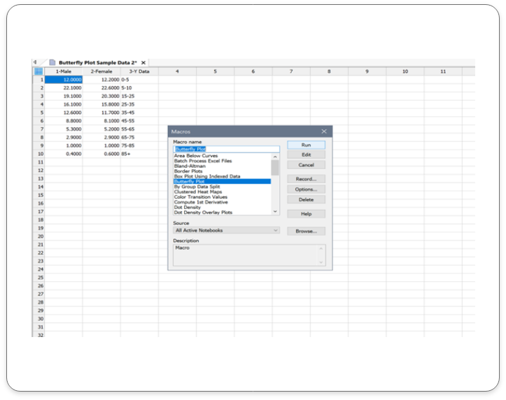
Output
The corresponding Butterfly Plot is as shown below:
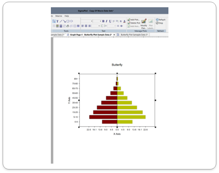
Application areas for the new Butterfly Plots in SigmaPlot v16.
1. Healthcare and Medicine:
- Clinical trial data: Compare treatment outcomes between different groups.
- Patient demographics: Analyze differences in patient characteristics between treatment groups.
- Disease progression: Track changes in disease markers over time.
2. Environmental Science:
- Climate change analysis:Compare temperature and precipitation data over time.
- Pollution monitoring: Analyze pollutant levels in different locations.
- Biodiversity studies: Compare species diversity in different ecosystems.
3. Social Sciences:
- Social surveys: Compare responses to survey questions between different groups.
- Election analysis: Visualize voting patterns and trends.
- Public opinion polling: Analyze public opinion on various issues.
4. Business and Marketing:
- Sales performance: Compare sales figures for different products or regions.
- Market share analysis: Visualize market share trends over time.
- Customer satisfaction: Compare customer satisfaction ratings for different products or services.
5. Financial Analysis:
- Comparing stock performance: Visualize the performance of two stocks over a specific period.
- Analyzing financial ratios: Compare financial ratios for different companies or time periods.
- Tracking economic indicators: Monitor changes in economic indicators like GDP, inflation, and unemployment rates.
By effectively visualizing data, butterfly plots can help you identify trends, make informed decisions, and communicate insights clearly
Key Benefits of Butterfly Plots in SigmaPlot v16:
- Simple and Intuitive: Butterfly plots are easy to understand and interpret, even for those without extensive statistical knowledge.
- Effective Comparisons: Quickly compare the distributions of two or more datasets to identify trends, outliers, and significant differences.
- Customizable Visualizations: Tailor your butterfly plots to match your specific needs and preferences, including color schemes, labels, and annotations.
Confidence and Prediction Bands:
Unleash the Power of Data Analysis using Confidence and Prediction Bands with SigmaPlot 16:
What are Confidence and Prediction Bands?
Confidence and Prediction bands are used to evaluate the rightness of fit in regression and to predict future data points.
This feature in SigmaPlot facilitates users to create confidence and prediction bands for regression. Earlier versions of the product supported Confidence and Prediction lines, however, now users can create bands for the same.
Input Data
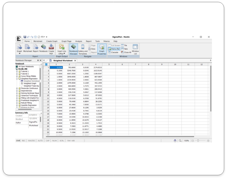
Click on the help tab and choose the non-linear regression tab. Double- click on the weighted regression work sheet to open the sample data set that will be used for the regression analysis.
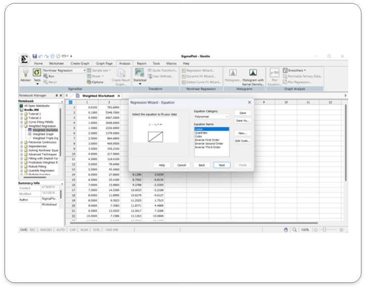
Select the analysis tab and click on the regression wizard. Select the regression type. Click next on the regression wizard after choosing the regression type ( Linear regression selected in this example).
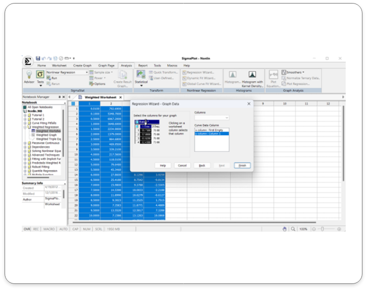
Click on your worksheet and select the columns for your graph and then click finish.
Output:
Confidence and Prediction bands are created along with the line.
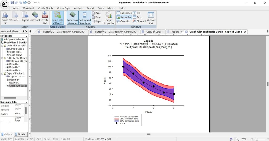
Application areas for the new Confidence & Prediction Bands in SigmaPlot v16.
1. Scientific Research
Biology and Medicine:
- Modeling disease progression
- Analyzing clinical trial data
- Predicting drug efficacy and safety
Chemistry:
- Calibrating instruments and measurements
- Modeling chemical reactions
Physics:
- Analyzing experimental data
- Predicting physical phenomena
2. Engineering
- Structural Engineering: Assessing the reliability and safety of structures
- Mechanical Engineering: Optimizing designs and predicting performance
- Electrical Engineering: Analyzing circuit behavior and predicting system performance
3. Economics and Finance
- Financial Modeling: Forecasting stock prices, interest rates, and economic indicators
- Risk Assessment: Quantifying uncertainty in financial models
- Economic Forecasting: Predicting economic growth and inflation rates
4. Social Sciences
- Psychology: Modeling human behavior and cognition
- Sociology: Analyzing social trends and patterns
- Political Science: Predicting election outcomes and public opinion
By using confidence and prediction bands, researchers and analysts can make more informed decisions and communicate their findings with greater confidence.
Key Benefits of Confidence & Prediction Bands in SigmaPlot v16:
- Enhanced Data Interpretation: Visualize uncertainty and identify regions of higher/lower confidence.
- Improved Decision-Making: Quantify risk and make informed decisions.
- Better Model Evaluation: Assess model fit and identify outliers/anomalies.
- Effective Communication: Clearly communicate uncertainty and variability in results.
Error Bars:
Visualize Uncertainty with Precision: Introducing Error Bars in SigmaPlot v16
What are Error Bands?
Error bars are a crucial tool in data visualization, providing valuable insights into the reliability and variability of data. They can represent confidence intervals, standard errors, standard deviations, or other relevant quantities. By visualizing uncertainty, error bars help prevent misinterpretation of data, avoid overestimating precision, and highlight significant differences between groups.
Input Data
In SigmaPlot v16, Error band support has been provided for the below mentioned graph styles in each of the graph types:
- Scatter Plot
- Line and Scatter Plot
Simple Scatter Error Bars:
A graphical representation of the variability of data used on graphs to indicate the error, or uncertainty in a reported measurement.
In SigmaPlot there is sample data available to understand error bars in scatter plots and Fitted curves.
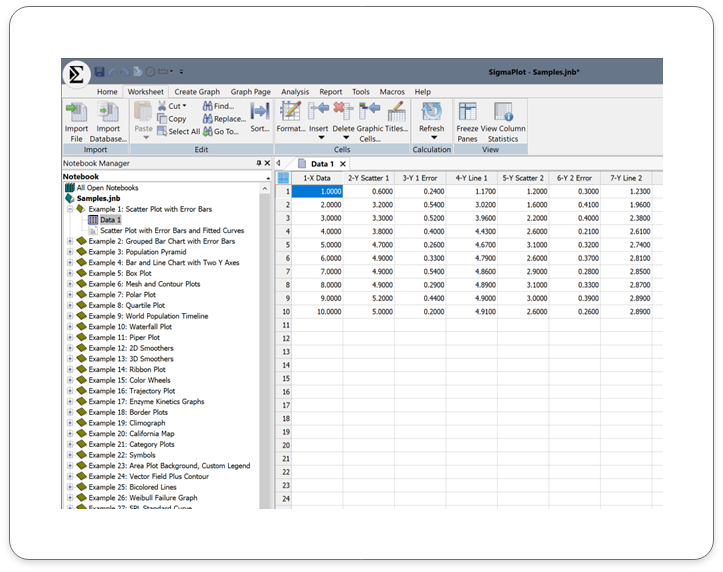
Image: Has Scatter Plot with Error plot Data and the corresponding Graph
Double click on the graph icon for scatter plot with Error Bars and Fitted curves and the below graph is created for the above data.
Output:
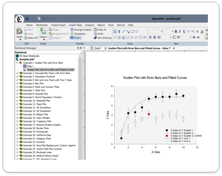
This line and scatter plot with error bars includes:
Application Areas for Error Bars in SigmaPlot v16:
Error bars are a versatile tool that can be applied to various scientific and engineering fields. Here are some common applications of error bars in SigmaPlot:
Scientific Research:
- Biology and Medicine: Compare treatment effects, analyze biological measurements, assess experimental precision.
- Chemistry: Quantify uncertainty, compare analytical methods, evaluate reproducibility.
- Physics: Analyze experimental data, estimate measurement error.
Engineering:
- Mechanical Engineering: Assess manufacturing variability, evaluate component reliability.
- Electrical Engineering: Analyze circuit performance, estimate measurement error.
Other Fields:
- Environmental Science: Monitor environmental variables and assess variability.
- Social Sciences: Analyze survey data and experimental results.
- Economics: Model economic trends and forecast outcomes.
Key Benefits of using the new Error Bands in SigmaPlot v16:
Enhanced Data Interpretation: Visualize uncertainty and variability in data.
Improved Decision Making: Make informed decisions based on reliable data. 3.
Effective Communication: Clearly communicate data and its limitations to others
Macro to Import Multiple Excel Sheets
Streamline Your Workflow using the new Macro to Import Multiple Excel Sheets
What is the Excel Multi-sheet Import Macro
This feature facilitates the user to import multiple sheets with defined ranges from an Excel file. The user can import multiple sheets with different ranges. Additional statements need to be added for every sheet along with the import statement. This would remain the same as it facilitates backward compatibility (Considering that all previous versions can import only the first sheet (Which remains same to support backward compatibility, which imports only the first sheet in an excel file).
Input Data
Steps to import multiple sheets from an Excel workbook:
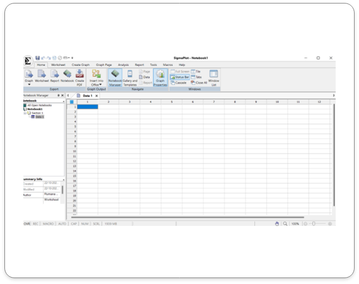
Open a new worksheet or any existing worksheet where the data must be imported from.
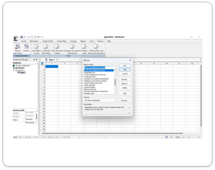
Open the Macros dialog and double click on the Macro tab. The pop-up box that comes up opens a list of options choose “Excel File Multi sheet Import” and press Edit.
Output
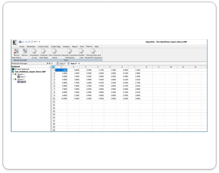
In this sample two worksheet with defined rows and columns of data has been imported. Clearly marked as Data 1 and Data 2.
Key Application Areas for use of the Macro to Import Multiple Excel Sheets in SigmaPlot v16:
Clinical Research: Import large datasets from multiple clinical trials.
Biomedical Research: Analyze data from various experiments and studies
Environmental Science: Import data from multiple monitoring stations or field studies.
Finance: Import data from multiple financial reports or databases.
Social Sciences: Import data from surveys, polls, or census data.
Engineering and Manufacturing: Import data from multiple testing or production runs.
Key benefits to using the Macro to Import Multiple Excel Sheets in SigmaPlot v16:
Time Efficiency: Automate the import process and save time.
Reduced Errors: Minimize errors associated with manual data entry
Increased Productivity: Focus on data analysis and interpretation, rather than data entry.
Enhanced Data Integrity: Ensure data consistency and accuracy
Improved Workflow: Streamline your data analysis workflow
SigmaPlot v16 Now supports Large Data:
Empowering Data Analysis for Large Datasets
Conquer Data Challenges of Large Data with SigmaPlot 16:
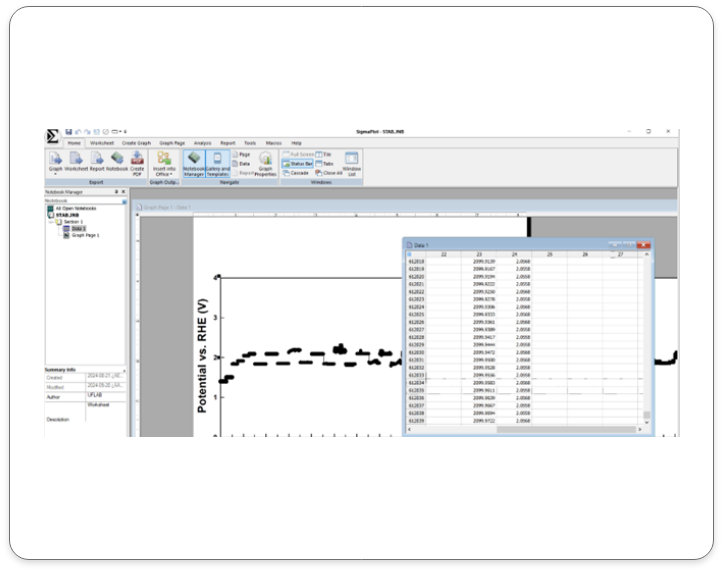
SigmaPlot 16 is designed to handle large datasets with ease. By enhancing its architecture, SigmaPlot 16 empowers you to analyze complex data sets without compromising performance or accuracy.
Input Data
Here is an example of a Large Data Set in SigmaPlot v16:
Output Data
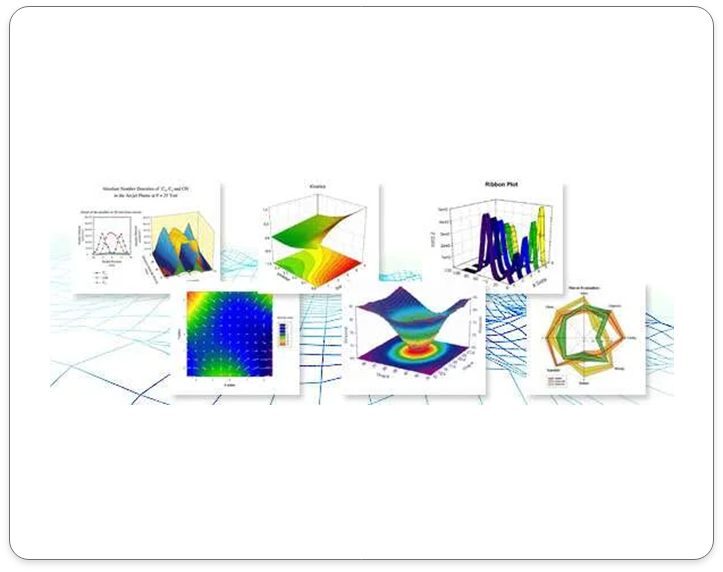
Here are some sample graph outputs using large data sets.
Key Application Areas of SigmaPlot 16 for Large Data:
Genomics and Bioinformatics: Analyze large-scale genomic and proteomic data.
Clinical Trials: Process and analyze vast amounts of clinical trial data
Environmental Science: Handle large datasets from environmental monitoring studies.
Financial Analysis: Analyze large financial datasets to identify trends and patterns.
Social Sciences: Analyze large-scale survey data and population studies.
Key Benefits of SigmaPlot 16 for Large Data:
- Efficient Data Handling: Seamlessly process and analyze large datasets.
- Improved Performance: Experience faster processing times and smoother workflows.
- Enhanced Visualization: Create clear and informative visualizations, even with complex data.
- Reliable Results: Trust in the accuracy and precision of your analyses.
Real-World Applications:
- Genomics and Bioinformatics: Analyze large-scale genomic and proteomic data.
- Clinical Trials: Process and analyze vast amounts of clinical trial data.
- Environmental Science: Handle large datasets from environmental monitoring studies.
- Financial Analysis: Analyze large financial datasets to identify trends and patterns.
