SigmaPlot has new features to make your work easier (click on the below links)
New Graph Type (via Macro)
- Heat Map
UI Modifications for Improved User Experience
- New and Refreshed Ribbon Manager
- New Home Button
- Separate Macros Tab
- Expanded Help
- Ribbons Configuration functionality available Quick Access Tab
- Histograms group on Analysis Tab
- New Tools Tab
- Dot Density Macro
Analysis Features
- Result Graphs
- User-Defined Transform Dialog
Miscellaneous Items
- Changed Clipboard Format for Excel to CF_SYLK
- New Licensing System
- Removed older Microsoft VS 2005 Redistributable
New Graph Type (Via a Macro)
Heat Map
Clustered Heat Maps Macro
Description of Heat Maps
A clustered heat map is a visualization of numeric data assigned to the levels of two categorical variables. This type of data can be displayed in a table where the rows refer to the levels of one variable and the columns refer to the levels of the other variable. The data table is typed into a SigmaPlot worksheet.
A heat map for this two-way data is constructed as a rectangular array of solid colors. The dimensions of the array and the positions of its individual color cells match the arrangement of the heat map data in the worksheet. The methods of assigning colors to data values are discussed below.
Heat maps assist in visualizing variations in the density of values in the data table. Put another way, heat maps are used to identify clusters of data.
Applications
The primary benefit of heat maps is that they make complicated data simpler to understand than the output of many other graphical or numerical techniques. One of the original applications of heat maps that is frequently used is to examine population density in a city or region. Heat maps are used by professionals in a variety of different fields:
- Business analytics – exploring data for a range of improvements and degrees of performance.
- Websites – visualizing the behavior of visitors.
- Exploratory Data Analysis – obtaining a relatively quick examination of data before deciding on how to model the data for more in-depth analysis.
- Molecular Biology – study patterns of difference and similarity in DNA and RNA.
- Marketing and Sales – showing how marketing and sales can be targeted by assessing sale trends and customer response in various geographic or demographic areas.
Input Data
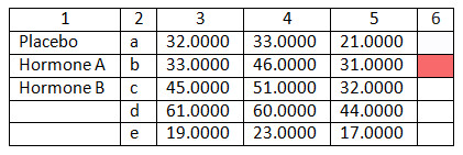
Worksheet data for a heat map is arranged in a number of columns. One column is for column labels and another column is for row labels. These labels appear on the axes for the heat map. You are allowed to create a heat map without providing labels.
The data to be selected for the heat map must be entered in adjoining columns. The number of rows of data can vary among the columns. When the heat map is created, the number of rows in the heat map equals the maximum number of rows in the selected data. Non-numeric data is allowed in the data table, but will be treated as missing values. The color assigned to a missing value is transparent.
One more column is needed for a color palette that will be used to generate the heat map colors. The palette is created by the user by using the Insert Graphic Cells dialog, the transform language, or manually by typing in a color code.
The colors assigned to the worksheet data depend on whether a discrete or continuous color scale is selected. The scales are based on the palette in the color column. For discrete color scales, the color column often uses an existing color scheme of 7 to 10 colors. For continuous color scales, the color column often contains only two or three colors, but can contain more.
Examples of heat map data are accessed from the Macro Data button in the Samples Files group on the Help tab of the SigmaPlot ribbon. When the button is pressed, the Macro Data Sets notebook opens in the Notebook Manager and heat map examples are provided in three sections.
An example of input data for heat maps is shown below.
Options
The Create Heat Map macro is accessed by pressing the Heat Map button in the Graphing Tools group on the Tools tab of the SigmaPlot ribbon. When running the macro, a dialog box appears for setting options to create a heat map. The settings are:
- Select the worksheet column in the Column labels drop-down list for the heat map’s column labels. Leave the display value blank if no column labels will be used.
- Select the worksheet column in the Row labels drop-down list for the heat map’s row labels. Leave the display value blank if no row labels will be used.
- Select the worksheet column in the First data column drop-down list for the first or leftmost column of the heat map’s data table. This selection is required.
- Select the worksheet column in the Last data column drop-down list for the first or leftmost column of the heat map’s data table. This selection is required.
- Select the type of color scale used in the heat map, either Discrete color scale or Continuous color scale.
If using a discrete color scale, the first color of the color column is assigned to the minimum of the data and the last color of the color column is assigned to the maximum of the data. The range of the data is then divided up uniformly into groups and the data within each group is assigned to the corresponding color in the palette.
- Color bars show the data to color conversion scale. Select the Show Color Bars to indicate whether color bars are or are not displayed, and if displayed, decide whether the color bar orientation is vertical (the default) or horizontal.
- When the Display numeric values in heat map checkbox is checked, a symbol plot showing the heat map data table is created and placed on top of the heat map so that numeric values, including missing values, are displayed over the corresponding heat map cells.
- The Select colors group box has two options for selecting the color palette. A Color column drop-down list is provided to select the palette from the worksheet. The alternative is to select the Use default colors shown below If this checkbox is checked, the heat map colors are created using a continuous color scale.
The Create Heat Map macro dialog box is shown below with settings made for the worksheet data shown above.
If using a continuous color scale, the first color of the color column or default color palette is assigned to the minimum of the data and the last color of the color column or default color palette is assigned to the maximum of the data. Linear interpolation on the components of the palette colors is used to assign a color to a particular data value based on the proportion of the data range for locating that data value.
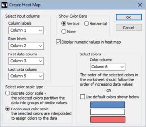
The settings in the dialog are saved to a text file in the user’s profile folder after pressing the OK button. When relaunching the macro, the dialog controls will show the same settings as before.
Output
After pressing the OK button, the macro code computes the graph data for the heat map, color bar, and data table plot, depending on the selected settings. After the graph data is placed in the worksheet, the graphing code in the macro creates a graph page showing the selected plots.
The heat map graph data consists of a rectangular array of all 1s that has the same dimensions as the heat map’s data table. The heat map is actually created as a horizontal stacked bar chart and this array is used to set the number and relative size of the bars for the heat map. In addition, there is a column of color data for the heat map where the number of colors in the column equals the number of cells in the data table. This gives a total of N + 1 columns for the graph data of a heat map where N is number of columns in the input data table.
The data table symbol plot contains three columns of graph data. The first two columns give the coordinate positions of the data values in the heat map. The last column is a list of all data values in the data table, column by column, but converted to text as is needed for a symbol plot.
The color bar also contains three columns of graph data. A vertical (horizontal) color bar is created as a horizontal (vertical) bar chart. If using a continuous color scale, the first column consists of 101 numeric values that uniformly span the range of the heat map data. The second column consists of 101 values, all equal to 1, for setting the size of the bars. The last column applies the color scale to the first column of data values to generate 101 colors for the color bar. If using a discrete color scale, then the same types of columns are created, but each column has the same number of rows as the color column selected in the dialog.
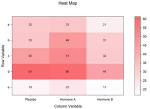
For the above worksheet data and setting shown above in the dialog, the heat map appears as below. After the graph is created, the Graph Properties dialog can be used for any desired edits.
UI Modifications for Improved User Experience
New and refreshed Ribbon Manager
- The new and refreshed ribbon manager enhances the already commendable user experience in SigmaPlot.
- Ribbons provide context sensitive feature groupings for enhanced functionality and ease of use.
- Icons are now desaturated, have high resolution and have expanded tooltips containing hot keys.
- Keyboard shortcuts are provided by the Alt Key-Tips.
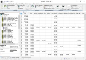
This refreshed ribbons manager enhances the user experience providing the user with easy navigation across the various functions of SigmaPlot v15.
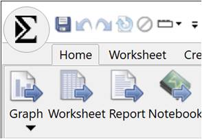
New Home Button
- The eye catching SigmaPlot Home button provides the user with easy navigation to Quick Start, Create New Notebooks, Open any saved SigmaPlot file, export to previous versions of SigmaPlot (up to SigmaPlot 11) and workbook protection with password and audit trails.
Separate Macros Tab
- SigmaPlot’s easy-to-use macro language helps users create macros in no time. Not a programmer? No problem. With SigmaPlot, you can record macros by point-and-click with the macro recorder. Use macros to acquire your data, execute powerful analytical methods, and create industry-specific or field-specific graphs.
- Use one of the thirty built-in macros as provided or use these macros as a base to quickly create your own macros.
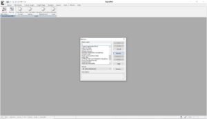
- The refreshed SigmaPlot v15, has a separate tab for Macros, making it easier for users to navigate to this great functionality of SigmaPlot.

- There are over 30 macros in SigmaPlot, giving users the capability of programmatic control over SigmaPlot features.
Expanded Help
- Help topics are immediately visible and separated into groups of similar types.
- Faster access to topics than the prior Help menu where topics were displayed using drop-down lists.
- Improved search in Help, giving you instant access to various Help Topics like Tutorials, User Guides, Technical Support and information on your current licensed version of SigmaPlot.
Ribbons Configuration functionality available via a Quick Access Tab
- The Ribbons configuration is now available on a Quick Access Tab from where instantly you can change the configurations between Default, Compact, Graphing & Analysis
Histograms group on Analysis Tab
- The analysis tab is the primary interface for data analysis features in SigmaPlot.
- The tab has been rearranged for easier use and includes a new Histograms group for better access to creating graphs with more advanced properties.
New Tools Tab
- Provides access to macros and apps that interface with SigmaPlot features to extend the program’s capabilities.
- The Graphing Tools group provide macros (tools) to create special graph types.
- The Office Tools group provides macros to send SigmaPlot results to Microsoft Office products.
- The Pharmacology group provides useful tools for Pharmacology studies.
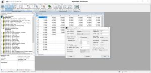
Dot Density Macro
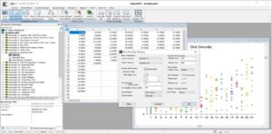
- The Dot Density Overlay Plots macro is now exposed on the new Tools tab for greater accessibility
Analysis Features
Result Graphs
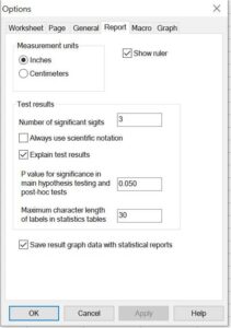
- Save result graph data with statistical reports.
- View and Save statistics results’ graph data with the option to revert to not saving result graph data with reports in case storage size becomes a problem. (Save result graph data with reports for anytime graph creation, turned on by default).
User-Defined Transform Dialog
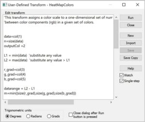
- A new check box allows the dialog to keep running after the Run button is pressed. Helpful for testing the results of a transform after making a series of changes to the transform text.
Miscellaneous Items
Changed clipboard format for Excel to CF_SYLK
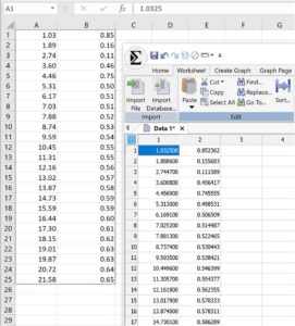
- so numbers pasted from Excel have full precision with the option to change Excel pasting in SigmaPlot to use the clipboard format CF_UNICODETEXT. (Paste numeric data from Excel into SigmaPlot using full precision without ability to paste non-ASCII characters.)
New Licensing System
- New Cloud based License Manager Server with 24/7 availability
- SigmaPlot v15 has the latest Sentinel License Manager which is compatible with the latest Microsoft Server 2022
Removed older Microsoft VS 2005 Redistributable
The new SigmaPlot v15 Removes all dependencies on old Visual Studio 2005 redistributable by replacing older software for graph export
