

Maximize your email impact with professionally designed templates.
SigmaPlot 16 makes it easy to create and customize violin plots. Download a free trial today and start visualizing your data like never before.

SigmaPlot is an advanced data analysis and graphing software designed to help you create precise, publication-quality graphs and charts. It moves beyond standard spreadsheets by offering a wide array of over 100 2-D and 3-D graph types, from simple scatter plots to complex radar and contour plots. The intuitive user interface, with its Microsoft Office-style ribbon controls and customizable Quick Access Toolbar, makes editing and visualizing data both quick and easy. You can obtain data from nearly any source, with support for various file formats including Microsoft Excel, SPSS, SAS, and ODBC databases, ensuring seamless integration into your workflow.
Beyond its powerful visualization capabilities, SigmaPlot offers a comprehensive suite of statistical analysis tools and automation features to streamline your research. It incorporates the advisory statistical features of SigmaStat, guiding you through nearly 50 of the most common scientific statistical tests and recommending appropriate analyses based on your data. The software also includes powerful regression wizards and a dynamic curve fitter to ensure accurate and reliable results. With the ability to create macros by simply pointing and clicking, you can automate repetitive tasks. This combination of powerful graphing, robust analysis, and seamless integration makes SigmaPlot an indispensable tool for researchers and scientists.

Why Choose SigmaPlot
Unmatched Precision for Scientific Visualizations
SigmaPlot empowers you to present your findings accurately with its precise, publicationquality graphs, comprehensive data analysis, and robust presentation tools.
It offers a wide array of scientific features, including automatic error bars, regression lines, confidence intervals, axis breaks, technical axis scales, nonlinear curve fitting, and a powerful data worksheet for seamless data handling.


Transform Your Data into Compelling
Scientific Narratives
Transform your raw data into elegant, publication-quality graphs with unparalleled ease. SigmaPlot provides extensive customization options, from sophisticated color schemes to flexible data organization, allowing you to craft compelling visual narratives.
Seamlessly export your creations into various formats, integrate them into PowerPoint presentations, or share them directly from the application
Collaboration. Simplified with SigmaPlot
SigmaPlot streamlines collaboration with colleagues and simplifies sharing your research with the world. Boost your efficiency by keeping discussions and feedback centralized, eliminating messy email threads.
Publish your work and securely invite others to view and provide feedback on your projects, all while maintaining complete control over access to your valuable data


Make More Accurate, More Informed
Analysis Choices with SigmaPlot
Transform your raw data into elegant, publication-quality graphs with unparalleled ease. SigmaPlot provides extensive customization options, from sophisticated color schemes to flexible data organization, allowing you to craft compelling visual narratives.
Unleash the Power of Your Data: Introducing SigmaPlot 16
Unveiling a suite of powerful new features, SigmaPlot 16 empowers you to delve deeper into your data and uncover hidden insights like never before. This upgrade delivers groundbreaking functionalities designed to streamline your research workflow and enhance your data visualization capabilities.

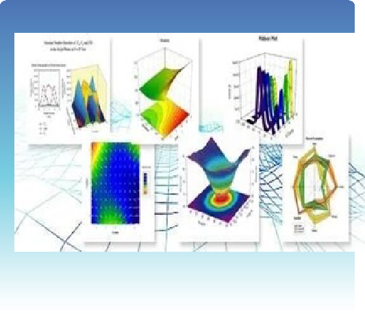
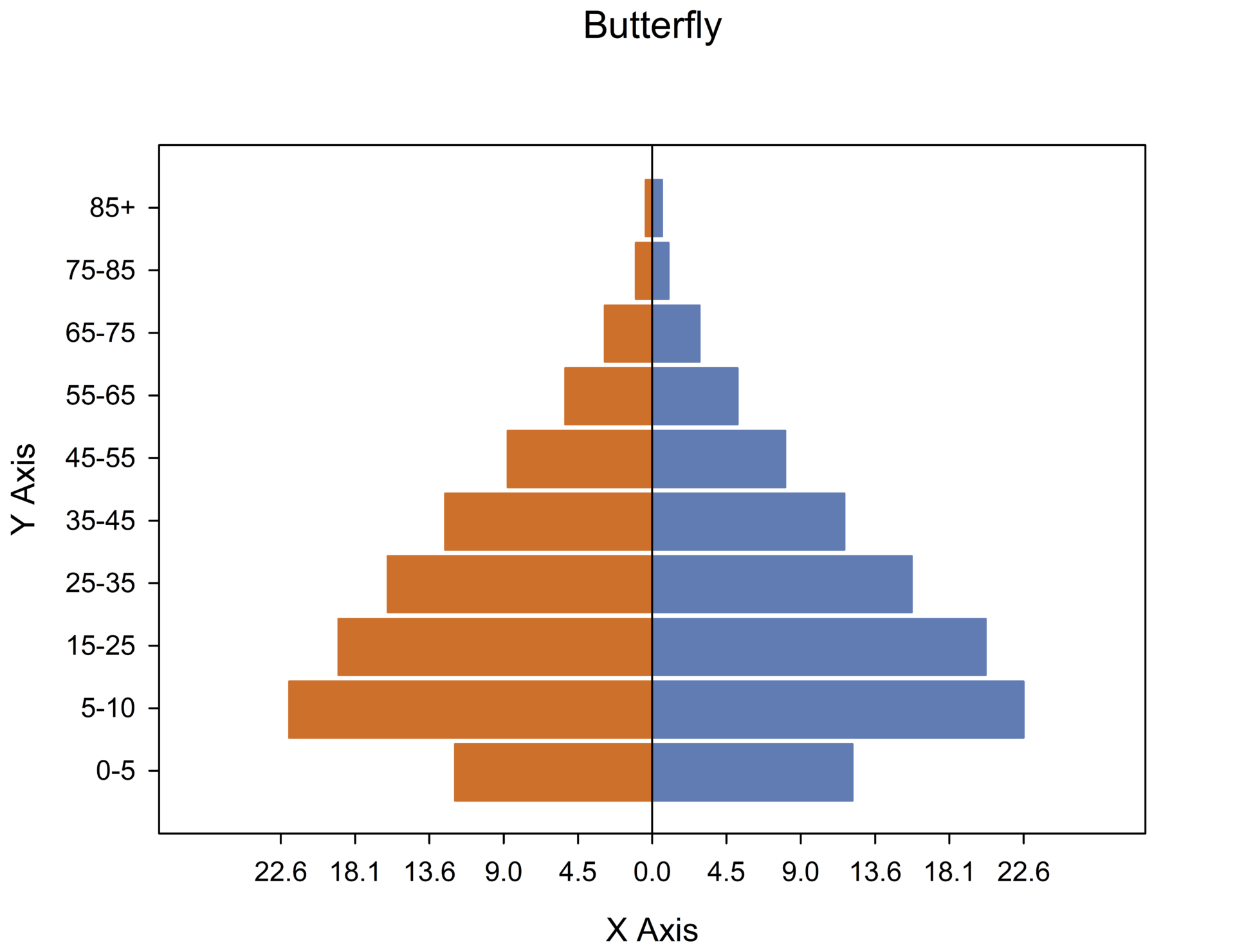
Butterfly Plot- a butterfly plot (also sometimes called a tornado or pyramid chart) is a type of bar chart used to compare two datasets side-by-side.

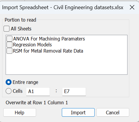
Macro to allow importing of all sheets of an Excel file – SigmaPlot v16 has a macro that will accept multiple worksheets from an Excel Workbook.

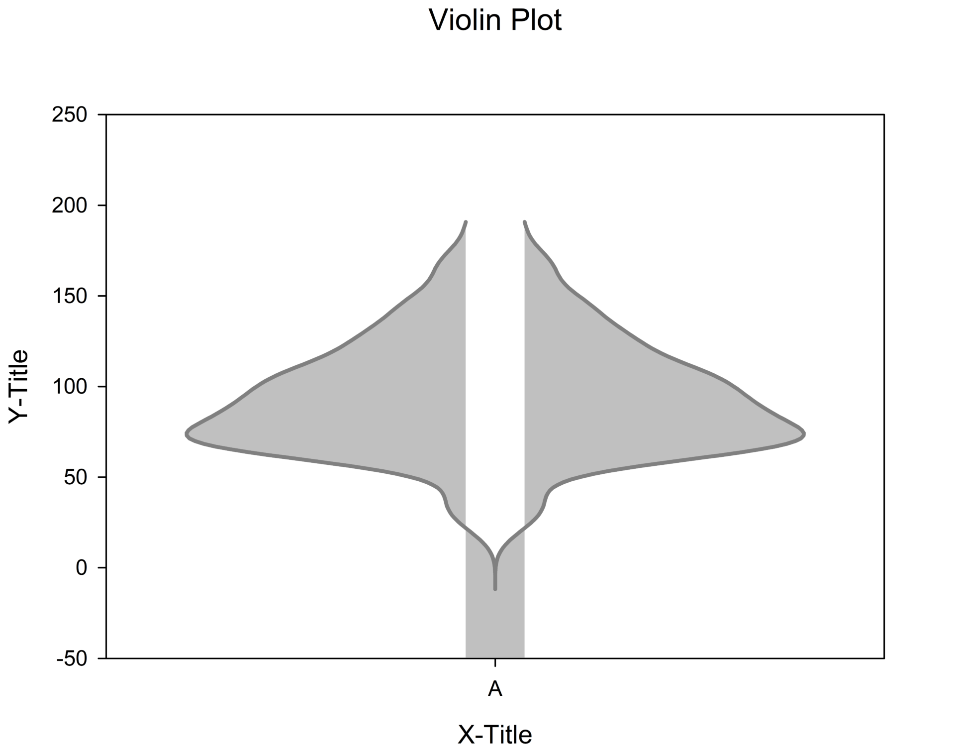
Violin Plots – are used to depict the distribution of numerical data for one or more groups. They provide the option to combine the kernel density curves, with box plots offering a more informative view of the data compared to a box plot alone.

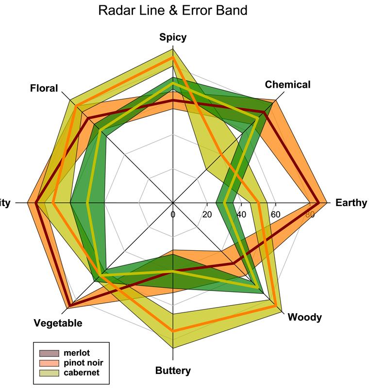
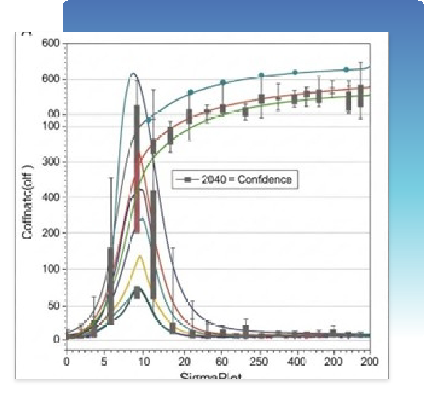
Error Bands - Error bands, also sometimes called error bars, are graphical representations of the variability or uncertainty associated with a data point or an estimated relationship in a graph. They are often used in various scientific and statistical visualizations.
