Features and Improvements in SigmaPlot
- Forest Plots
- Kernel Density Plots
- 10 New Color Schemes
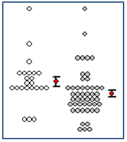
- Dot Density Graph with mean and standard error bars
- Legend Improvements
- Horizontal, Vertical and Rectangular Legend Shapes
- Cursor over side or upper or lower handle

-
- allows for multi-column legends
-
- User interface to set number of legend item columns in the Properties dialog. The permissible column numbers are displayed in the combo list
- Change the number of legend item columns by selecting and dragging the middle handle in the bounding box
- Reorder legend items
- Through properties dialog – move one or multiple legend items up or down using the up/down control on top of the list box
- Through cursor movement – move one or multiple legend items up or down. Select the legend item(s) and use keyboard up and down arrow key for movement within the bounding box
- Through mouse select and cursor movement for items in the bounding box
- Individual legend items property settings – select individual legend items and use the mini tool bar to change the properties
- Legend box blank region control through cursor
- Cursor over corner handle


- allows proportional resizing
- Add simple direct labeling
- Support “Direct Labeling” in properties dialog using the checkbox control “Direct Labeling”
- Ungroup legend items – the individual legend items can be moved to preferred locations and move in conjunction with the graph
- Legend Title support has been added (no title by default). The user can add a title to the legend box using the legend properties panel
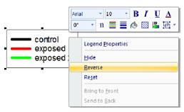
- Reverse the legend items using the right click context menu
- Open Legend Properties by double clicking either Legend Solid or Legend Text
- Reset has been added to legends to reset legend options to default
- Horizontal, Vertical and Rectangular Legend Shapes
Analysis Features
- Principal Component Analysis (PCA)
- Analysis of Covariance (ANCOVA)
- Added P values to multiple comparisons for non-parametric ANOVAs
- Removed the combo box choices for multiple comparison significant levels and tied the significance level of multiple comparisons to the main (omnibus) test
- Added the Akaike Information Criterion to Regression Wizard and Dynamic Fit Wizard reports and the Report Options dialog
- Added back the Rerun button in the SigmaStat group
- Updated the fit library standard.jfl
- Added probability functions, to now include 24, for curve fitting or function visualization
- The tolerance value for all equations has been modified to use “e-notation” instead of fixed decimal. This allows the user to read the value without scrolling.
- Add seven weighting functions to all curve fit equations in standard.jfl. There is a slight variant added for 3D equations.
User Interface Features
- Rearrange Notebook items in a section by dragging
- SigmaPlot tutorial PDF file
- Line widths from a worksheet column
Import/Export Features
- Added the SVG and SWF file formats for scalable vector graphics export
- Added Vector PDF export to improve on the existing raster PDF
- File import and export support is added for Versions 13 and 14 of Minitab, Version 9 of SAS, Version 19 of SPSS and Version 13 of Symphony
SigmaPlot Product Features
Forest Plot
A forest plot is one form of “meta-analysis” which is used to combine multiple analyses addressing the same question. Meta-analysis statistically combines the samples of each contributing study to create an overall summary statistic that is more precise than the effect size in the individual studies. Individual study values and their 95% confidence intervals are shown as square symbols with horizontal error bars and the overall summary statistic as a diamond with width equal to its 95% confidence interval.

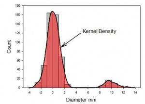
Kernel Density
The kernel density feature will generate an estimate of the underlying data distribution. This should be compared to the step-like histogram. It has advantages (no bars) and disadvantages (loss of count information) over a histogram and should be used in conjunction with the histogram. They can be created simultaneously.
Dot Density with Mean & Standard Error Bars
The mean plus standard error bar computation, symbol plus error bars, has been added to the Dot Density graph. This enhances the other possible dot density display statistics – mean, median, percentiles and boxplot.

Color Schemes
Ten new color schemes have been implemented. Three examples are shown below:
Legend Improvements – Shapes
Vertical, horizontal and rectangular legend shapes are now available.

Reverse Legend Order
You can now select to reverse the legend item order. This provides a more logical order for some graph types.
Reorder Legend Items
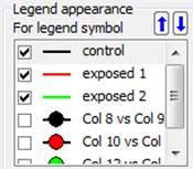
There are three ways to reorder the legend items. As shown here, you can move one or multiple legend items up or down using the up/down arrow controls in the Legends panel of Graph Properties. Even easier, just select the item in the legend and use the keyboard up and down arrow keys. Or select the legend item and drag it to the new position with the mouse cursor.
Mini-Toolbar Editing of Legend Items
Legend items may now be edited by clicking on the item and using the mini-toolbar.

Direct Labeling
The legend can now be ungrouped and individual legend items placed adjacent to the appropriate plots. The labels will move with the graph to maintain position with respect to the graph. Since the label is adjacent to the plot, visual identification of each plot is now much easier.
Principal Component Analysis (PCA)

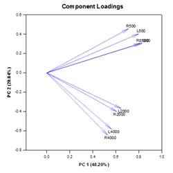
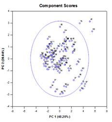
Principal component analysis (PCA) is a technique for reducing the complexity of high-dimensional data by approximating the data with fewer dimensions. Each new dimension is called a principal component and represents a linear combination of the original variables. The first principal component accounts for as much variation in the data as possible. Each subsequent principal component accounts for as much of the remaining variation as possible and is orthogonal to all of the previous principal components.
You can examine principal components to understand the sources of variation in your data. You can also use them in forming predictive models. If most of the variation in your data exists in a low-dimensional subset, you might be able to model your response variable in terms of the principal components. You can use principal components to reduce the number of variables in regression, clustering, and other statistical techniques.
You can examine principal components to understand the sources of variation in your data. You can also use them in forming predictive models. If most of the variation in your data exists in a low-dimensional subset, you might be able to model your response variable in terms of the principal components. You can use principal components to reduce the number of variables in regression, clustering, and other statistical techniques.
Graphical output consists of Scree, Component Loadings and Component Scores plots.
Analysis of Covariance (ANCOVA)
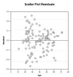
A single-factor ANOVA model is based on a completely randomized design in which the subjects of a study are randomly sampled from a population and then each subject is randomly assigned to one of several factor levels or treatments so that each subject has an equal probability of receiving a treatment. A common assumption of this design is that the subjects are homogeneous. This means that any other variable, where differences between the subjects exist, does not significantly alter the treatment effect and need not be included in the model. However, there are often variables, outside the investigator’s control, that affect the observations within one or more factor groups, leading to necessary adjustments in the group means, their errors, the sources of variability, and the P-values of the group effect, including multiple comparisons.
These variables are called covariates. They are typically continuous variables, but can also be categorical. Since they are usually of secondary importance to the study and, as mentioned above, not controllable by the investigator, they do not represent additional main-effects factors, but can still be included into the model to improve the precision of the results. Covariates are also known as nuisance variables or concomitant variables.
ANCOVA (Analysis of Covariance) is an extension of ANOVA obtained by specifying one or more covariates as additional variables in the model. If you arrange ANCOVA data in a SigmaPlot worksheet using the indexed data format, one column will represent the factor and one column will represent the dependent variable (the observations) as in an ANOVA design. In addition, you will have one column for each covariate. When using a model that includes the effects of covariates, there is more explained variability in the value of the dependent variable.
This generally reduces the unexplained variance that is attributed to random sampling variability, which increases the sensitivity of the ANCOVA as compared to the same model without covariates (the ANOVA model). Higher test sensitivity means that smaller mean differences between treatments will become significant as compared to a standard ANOVA model, thereby increasing statistical power.
As a simple example of using ANCOVA, consider an experiment where students are randomly assigned to one of three types of teaching methods and their achievement scores are measured. The goal is to measure the effect of the different methods and determine if one method achieves a significantly higher average score than the others. The methods are Lecture, Self-paced, and Cooperative Learning. Performing a One Way ANOVA on this hypothetical data gives the results in the table below, under the ANOVA column heading. We conclude there is no significant difference among the teaching methods. Also note that the variance unexplained by the ANOVA model which is due to the random sampling variability in the observations is estimated as 35.17.
It is possible that students in our study may benefit more from one method than the others, based on their previous academic performance. Suppose we refine the study to include a covariate that measures some prior ability, such as a state-sanctioned Standards Based Assessment (SBA). Performing a One Way ANCOVA on this data gives the results in the table below, under the ANCOVA column heading.
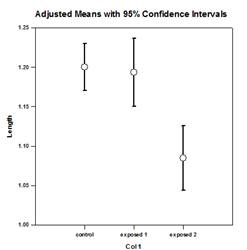
The adjusted mean that is given in the table for each method is a correction to the group mean to control for the effects of the covariate. The results show the adjusted means are significantly different with the Lecture method as the more successful. Notice how the standard errors of the means have decreased by almost a factor of three while the variance due to random sample variability has decreased by a factor of ten. A reduction in error is the usual consequence of introducing covariates and performing an ANCOVA analysis.
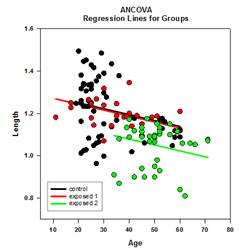
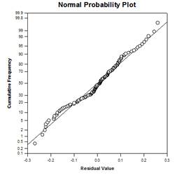
There are four ANCOVA result graphs – Regression Lines in Groups, Scatter Plot of Residuals, Adjusted Means with Confidence Intervals, and Normality Probability Plot:
P Values for Nonparametric ANOVAs
The non-parametric ANOVA tests in SigmaPlot are the Kruskal-Wallis test (One-Way ANOVA on Ranks) and the Friedman test (One-Way Repeated Measures ANOVA on Ranks). Both of these provide four post-hoc testing procedures to determine the source of significant effects in the treatment factor. The four procedures are Tukey, SNK, Dunn’s, and Dunnett’s.
The first three procedures can be used to test the significance of each pairwise comparison of the treatment groups, while the last two can be used to test the significance of comparisons against a control group. Dunn’s method is the only procedure available if the treatment groups have unequal sample sizes.
When a post-hoc testing procedure is used, a table is given in the report listing the results for the pairwise comparisons of the treatment levels. The last column of the table shows whether the difference in ranks is significant or not. In previous versions of SigmaPlot there is no adjusted p-value given that can be compared to the significance level of the ANOVA (usually .05) to determine significance.
This is because SigmaPlot had been determining significance by comparing the observed test statistic, computed for each comparison, to a critical value of the distribution of the statistic that is obtained from a lookup table. SigmaPlot had two sets of lookup tables for the probability distributions corresponding to the four post-hoc methods, where one set was for a significance level of .05 and another set was for a significance level of .01.
This was recently changed to use analytical procedures to compute the p-values of these distributions, making the lookup tables obsolete. Because of this change, we are now able to report the adjusted p-values for each pairwise comparison. This change also makes it possible to remove the restriction of using .05 and .01 as the only significance levels for multiple comparisons. Thus the user can enter any valid P value significance level from 0 to 1.
Akaike Information Criterion (AICc)
The Akaike Information Criterion (AIC) provides a method for measuring the relative performance in fitting a regression model to a given set of data. Founded on the concept of information entropy, the criterion offers a relative measure of the information lost in using a model to describe the data. More specifically, it gives a tradeoff between maximizing the likelihood for the estimated model (the same as minimizing the residual sum of squares if the data is normally distributed) and keeping the number of free parameters in the model to a minimum, reducing its complexity. Although goodness-of-fit is almost always improved by adding more parameters, overfitting will increase the sensitivity of the model to changes in the input data and can ruin its predictive capability.
The basic reason for using AIC is as a guide to model selection. In practice, it is computed for a set of candidate models and a given data set. The model with the smallest AIC value is selected as the model in the set which best represents the “true” model, or the model that minimizes the information loss, which is what AIC is designed to estimate. After the model with the minimum AIC has been determined, a relative likelihood can also be computed for each of the other candidate models to measure the probability of reducing the information loss relative to the model with the minimum AIC. The relative likelihood can assist the investigator in deciding whether more than one model in the set should be kept for further consideration.
The computation of AIC is based on the following general formula obtained by Akaike
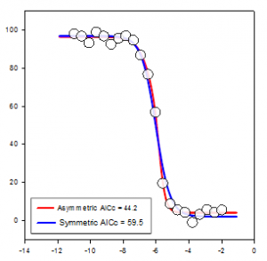
It is seen that AICc imposes a greater penalty than AIC when there are extra parameters. Most authors seem to agree that AICc should be used instead of AIC in all situations and it is AICc that is implemented in SigmaPlot. The Asymmetric equation in the graph is significantly better than the Symmetric since its AICc value is greater than 7 units less than the Symmetric equation – a rule of thumb for AICc. If the difference is greater than 2 then the equation with the smaller AICc value should not be considered as the best but rather a candidate for the best equation.
Nonlinear Regression Probability Functions
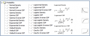
24 new probability fit functions have been added to the fit library standard.jfl. These functions and some equations and graph shapes are shown below.
Nonlinear Regression Weighting Functions
There are now seven different weighting functions built into each nonlinear regression equation (3D are slightly different). These functions are reciprocal y, reciprocal y squared, reciprocal x, reciprocal x squared, reciprocal predicteds, reciprocal predicteds squared and Cauchy. The iteratively reweighted least squares algorithm is used to allow the weights to change during each nonlinear regression iteration. In this way “weighting by predicteds”, a commonly used method, can be obtained by selecting the reciprocal_pred weighting option.
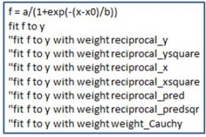
Also, Cauchy weighting (select weight_Cauchy) can be used to fit an equation to data that contains outliers and the effect of the outliers will be minimized. Users can create their own weighting methods in terms of residuals and/or parameters to implement other robust fitting methods. The equation section of a fit file is shown with the seven built-in weighting functions.
User Interface Features – Rearrange items in your notebook by dragging
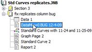
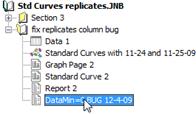
Objects in a notebook section are not necessarily created in a logical order. You can now drag items within a section to new positions to place them more logically.
An Updated SigmaPlot Tutorial
The new tutorial makes creating graphs for the first time easy. It starts with simple examples and gradually becomes more complex.

Specify Plot Line Widths from a Worksheet Column
Line width values can now be entered in a worksheet column. These values may be used within a graph or across multiple graphs on the page.
Vector Export File Formats
SVG (Scalable Vector Graphics), SWF (Adobe Flash Player) and Vector PDF file formats have been added. These are scalable formats where no resolution is lost when zooming to different levels. SVG is the standard graphics format for the web and SWF can be used with Adobe Flash Player. Because pdf is used so frequently, the vector PDF format is now attached to the Create PDF button on the Home ribbon.
Updated Application File Formats
File import and export support has been updated to Versions 13 and 14 of Minitab, Version 9 of SAS and Version 19 of SPSS.
